Kick Your Emails Up a Notch
Britney Yunker knows a thing or two about what works for direct-to-consumer (DTC) wineries and breweries. To help you make the most of the weeks ahead, she shares campaign tips that will encourage more engagement and lead to more sales.
Over the years we have seen hundreds of campaigns—we’ve seen the good, the bad and the ‘What are they thinking?!’ These days marketing emails are flooding to inboxes hourly. Some are gorgeously designed, and some are just…meh.
If your campaigns are on the ‘meh’ end of the spectrum, we’ve got some easy-to-follow guidelines that will help. And shhh…the even better news is that you don’t need a professional designer to implement these tips.
It comes down to three simple things:
#1: Image. Is. Key.
Use an evocative, well-photographed image at the top of your campaign. It will draw your audience in and they’ll want to find out more. BUT! You don’t need a photography pro to capture a cool shot. Here are some tips for photographing your own images:
· Natural light is best. Set up your items by a window (or outside) with plenty of indirect or diffused sunlight.
· Experiment with some creative angles and positioning. For example, try an extreme closeup of the item with the festive tasting room or vineyard out-of-focus in the background.
· Cropping is your friend. If you’re taking pictures in a visually busy environment, crop out extraneous ‘noisy’ imagery so that the focus is on the product you’re selling.
SOME IMAGE EXAMPLES THAT WE LOVE:

This image is shot outdoors but uses indirect light. Even though there are shadows, it’s still easy to see the product and the out of focus background adds some depth and interest.

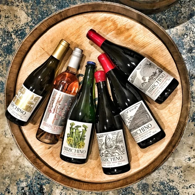
This image is cropped in to focus on the wine. The different textures and depth make this shot interesting.
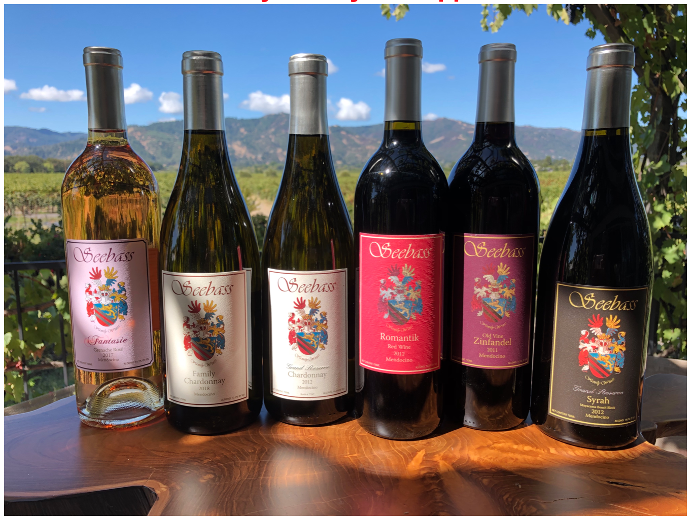
This shot keeps the wine front and center, but you also get a glimpse of vineyards and mountains in the background. The bottles are lit with indirect sunlight and not in the harsh sun.

This image is cropped in to focus on the wine. The different textures and depth make this shot interesting.
#2 Simple, clean, crisp design
Our eyes and brains like to know where to look. If you have a bunch of various sized imagery, text boxes and fonts customers get confused and you lose their attention instantly. Be concise and direct with your look and feel.
· Templates are your friend. MailChimp has several well-designed pre-built templates to choose from and expand upon. This is a great place to start. Experiment with various templates and see which one feels good to you. Note that the idea here is to choose a template as the design backbone of your campaign and then you can customize it using your own colors, logo, fonts, etc. Don’t get hung up on a color scheme or font in a default template you otherwise love—that’s all customizable to your own brand.
· Be concise with your imagery. You don’t want a lot of differently-sized images scattered throughout your campaign. You’ll lose your audience fast as their eyes won’t know where to go. Instead, choose one or two images that really rock so that customers naturally want to scroll, click, and read more.
· Be concise with your words. Truth: Most people don’t read. If your email is too wordy, it will get overlooked and ignored. Folks are looking for the big, bold ‘Purchase’ button so that they can buy the item quickly and efficiently. By all means, link your campaign to full vintage notes, expanded winemaker tasting notes, and suggested pairings to pages on your website. That way, if your customers do want to read up, they can. This is accomplished by showing a sentence or two of the notes in your campaign and then including a ‘Read More’ link that maps to a page on your website which includes the full story, notes, recipe, etc.
#3 Have a Strong, Clear Call-To-Action
Make it dead-simple for your customers to know where to click in order to purchase. Don’t make them hunt for the link.
· MailChimp’s button element can be customized with your brand’s look, feel, and color scheme. Don’t think that a button is too ‘salesy’. The button doesn’t need to be large and obnoxious. Make it your own and it will incorporate nicely into your campaign.
· You are not limited to MailChimp’s button element. Note that you can also search for pre-made custom buttons; for example ‘green and gold purchase buttons’—and grab any that you like. In that case, you’d bring it in as an image element and then link from there.
· Note: That’s not to say that you shouldn’t use ‘Click Here to purchase’ text in the body of your email. But I wouldn’t use just text. Incorporate a button as well so that your customers have a clear indication of where to click.
SOME TEXT AND BUTTON FORMATTING THAT WE LOVE:
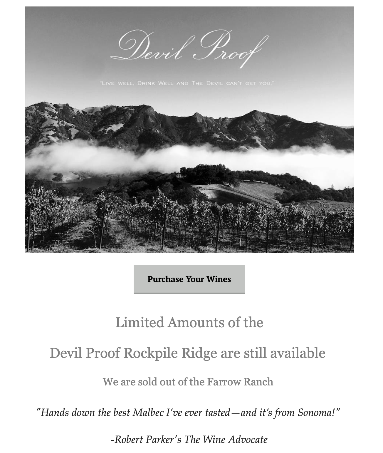
The copy in this image is in the sky where there is less going on and it’s easier to read. And the image is aspirational—who wouldn’t want a piece of that beautiful vineyard? The copy is short while still providing a sense of urgency and the call-to-action too obvious.
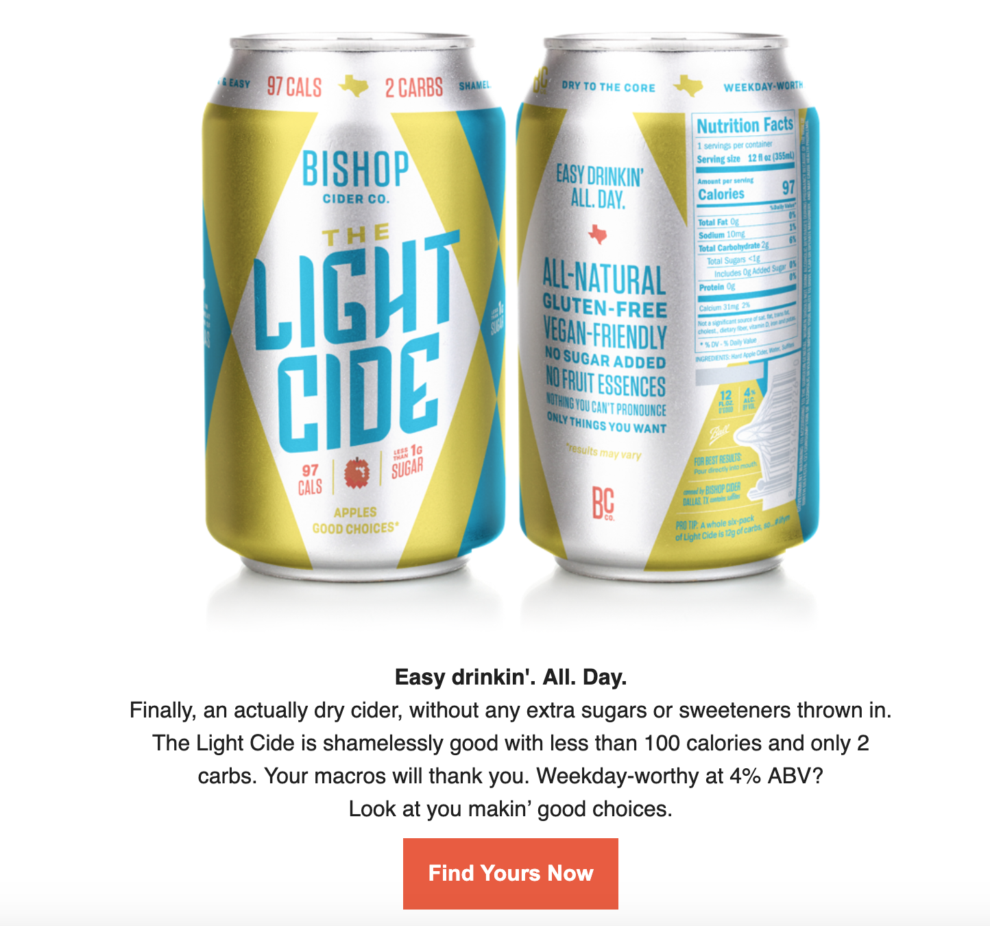
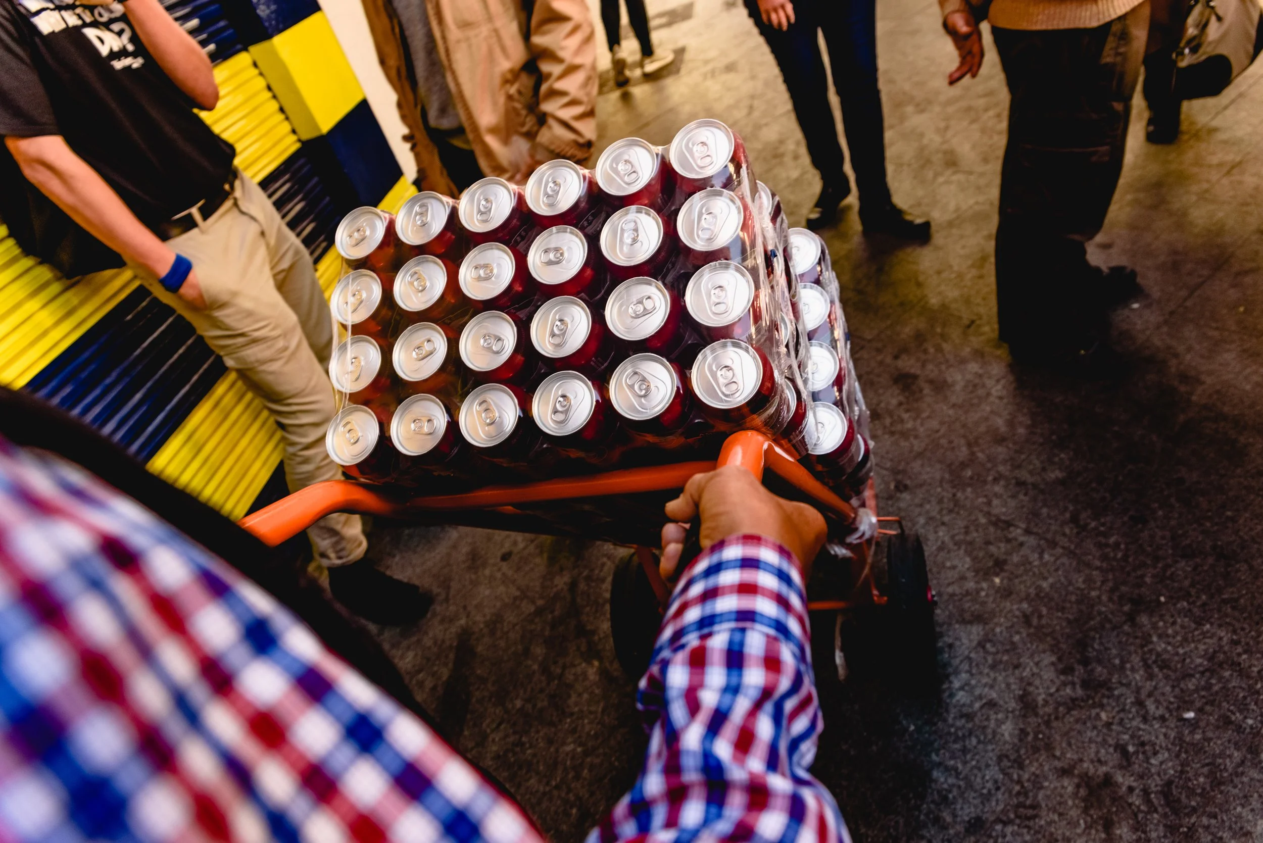
This clean shot shows the product front and center. Without anything to distract the eye, the reader can clearly see information and branding on the can. The copy reinforces the message is kept minimal. The button sticks out and provides a clear call-to-action.
Bottom line: When you combine a great image, crisp design, and a strong call-to-action, your campaigns will absolutely attract more engagement, and most importantly, more clicks—which translates into more sales.